Design system
The web app's tokens, symbols and components, and the rules for using them. The code is in three places:
| Path | Holds |
|---|---|
apps/web/src/index.css | The tokens: colours for light and dark, the type scale, radii, shadows and motion, as CSS variables that Tailwind reads through @theme inline |
apps/web/src/components/ui/ | The components and the symbols that draw tasks, people and agents |
apps/web/src/lib/symbols.ts | Which status, priority and type mark a task gets, and which avatar a person or agent gets |
The page /design of the app draws every token, symbol and component from that code. Open it at http://localhost:5173/design with pnpm --filter @ntasks/web dev, or at http://localhost:8787/design with pnpm dev. Its theme switch draws it in light or dark whatever the system prefers. pnpm screenshots design captures it in both themes (tools/screenshots):
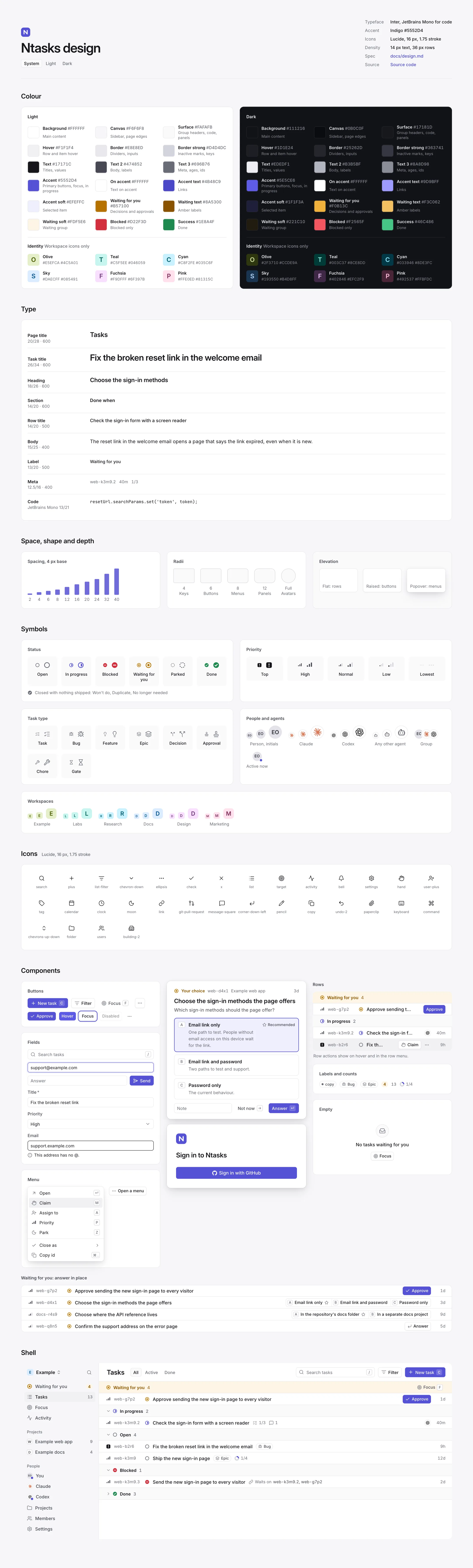
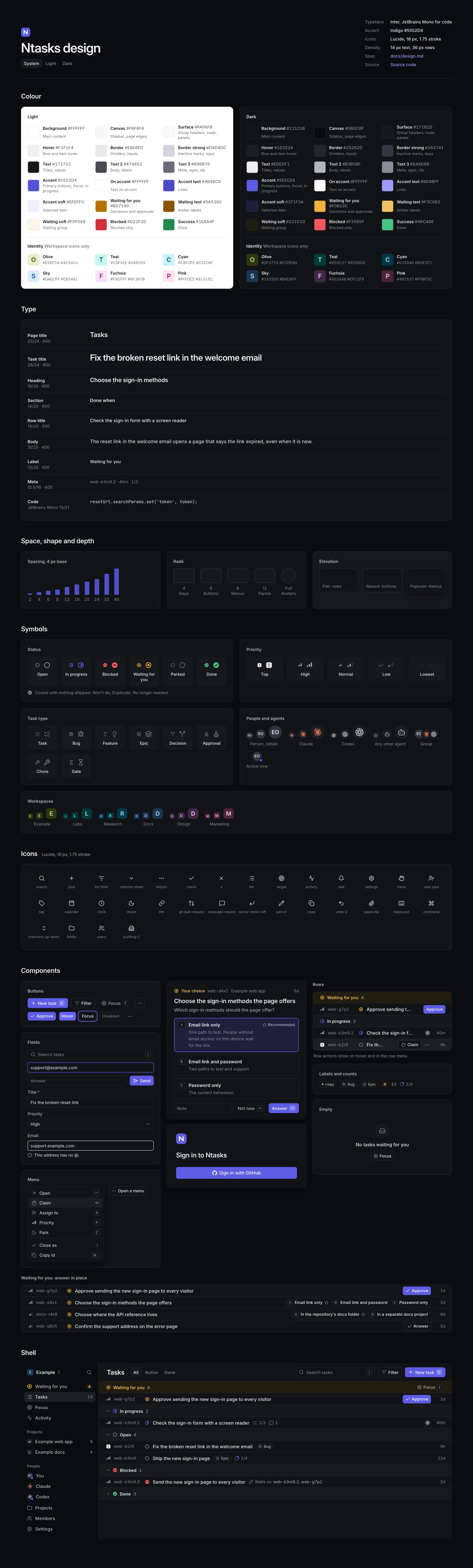
The rules
- Body text is 14 px. A list row is one line, 36 px tall.
- Greys order the text: Text for titles and values, Text 2 for body and labels, Text 3 for ids, ages and other facts.
- Accent, an indigo, marks the one primary action in a view, the focused control, the selected item and work in progress. Nothing else is indigo.
- Amber means only Waiting for you. Red means only Blocked. Green means only Done. No other state, warning or error uses these colours.
- Every action has a key, and the control shows it in a
Kbd. - A row shows its task's id.
Colour
Light is the root's theme. .dark on <html> switches every token, and src/theme.ts sets it while the system prefers dark. .light or .dark on any element draws that element's subtree in that theme, which the gallery uses to show both palettes side by side. A part of a page drawn in a theme of its own goes in a ThemeScope (popover.tsx), so the popovers opened inside it render inside it and take its theme too.
A token's variable name, without --, is its Tailwind colour: --ink-3 is text-ink-3, --canvas is bg-canvas. Components use the utilities and never a hex value.
| Name | Variable | Light | Dark | Role |
|---|---|---|---|---|
| Background | --background | #FFFFFF | #111216 | Main content |
| Canvas | --canvas | #F6F6F8 | #0B0C0F | The sidebar and page edges |
| Surface | --surface | #FAFAFB | #17181D | Group headers, code, panels |
| Hover | --hover | #F1F1F4 | #1D1E24 | A hovered row or item, the current sidebar item |
| Border | --border | #E8E8ED | #25262D | Dividers, the edges of fields and buttons |
| Border strong | --border-strong | #D4D4DC | #363741 | Inactive marks (empty priority bars), keys |
| Text | --ink | #17171C | #EDEDF1 | Titles, values |
| Text 2 | --ink-2 | #474852 | #B3B5BF | Body, labels |
| Text 3 | --ink-3 | #696B76 | #8A8D98 | Ids, ages, counts, placeholders, icons in controls |
| Accent | --accent | #5552D4 | #5E5CE6 | Primary buttons, focus, in progress |
| On accent | --on-accent | #FFFFFF | #FFFFFF | Text and icons on Accent |
| Accent text | --accent-text | #4B48C9 | #9D9BFF | Links, task ids in text, code keywords |
| Accent soft | --accent-soft | #EFEFFC | #1F1F3A | The selected option, the focus halo of a field |
| Waiting for you | --wait | #B57100 | #F0B13C | The Waiting for you mark |
| Waiting text | --wait-text | #8A5300 | #F3C062 | Amber words: the Waiting for you heading and count |
| Waiting soft | --wait-soft | #FDF5E6 | #221C10 | The Waiting for you group's background |
| Blocked | --block | #D22F3D | #F2565F | The Blocked mark |
| Success | --done | #1E8A4F | #46C486 | The Done mark, strings in code |
The marks have four tokens of their own:
| Variable | Light | Dark | Role |
|---|---|---|---|
--avatar | #E3E3EA | #30313B | A person's circle |
--avatar-ink | #33343C | #E6E6EC | A person's initials |
--mark-bg | #FFFFFF | #1B1C22 | An agent's circle |
--blossom | #000000 | #FFFFFF | Codex's mark |
The identity palette gives each workspace's icon a colour of its own, and nothing but a workspace's icon uses it. Its six hues stay apart from Accent, amber, red and green, so none reads as a state, and each letter is at least 4.5:1 on its fill in both themes, which apps/web/test/design.test.tsx checks. These tokens have no Tailwind names: WorkspaceIcon reads them with var(), so no other component can draw with them through a utility.
| Hue | Fill, letter | Light | Dark |
|---|---|---|---|
| Olive | --identity-olive, --identity-olive-ink | #E5EFCA, #4C5A01 | #2F3710, #CCDE9A |
| Teal | --identity-teal, --identity-teal-ink | #C5F5EE, #046059 | #003C37, #8CE8DD |
| Cyan | --identity-cyan, --identity-cyan-ink | #C8F2FE, #035C6F | #033946, #8DE3FC |
| Sky | --identity-sky, --identity-sky-ink | #DAECFF, #085491 | #193550, #B4D8FF |
| Fuchsia | --identity-fuchsia, --identity-fuchsia-ink | #F9DFFF, #6F397B | #402846, #EFC2F9 |
| Pink | --identity-pink, --identity-pink-ink | #FFE0ED, #81315C | #492537, #FFBFDC |
An error, such as a field the server refused or a request that failed, is not red: its words are in Text after a circle-alert icon, and a refused field is ringed in Text.
These are the only colour names index.css defines.
Type
Two typefaces, both served with the app from exactly pinned packages and never from a font service:
- Inter, variable, with its optical-size axis (
@fontsource-variable/inter,opsz.css). The body turns on two of its character variants:cv05, a lowercase l with a tail, andcv08, a capital I with serifs, sol,Iand1differ. - JetBrains Mono, variable (
@fontsource-variable/jetbrains-mono), for code.
The Worker's own pages (sign-in, agent approval, an expired link) are HTML the Worker writes, outside the app's build. They load Inter's Latin file from /fonts/inter-latin-opsz-normal.woff2, which the build copies from the same pinned package (apps/web/server-fonts.config.ts), and fall back to the system's sans serif for other scripts. Their colours are copies of the tokens in workers/api/src/access/page-look.ts; apps/web/test/design.test.tsx fails when one differs from index.css.
nums sets tabular figures and turns off Inter's contextual alternates, so a hyphen between figures stays a hyphen. Ids, ages and counts use it.
| Utility | Size / line height | Weight | Use |
|---|---|---|---|
text-task-title | 26 / 34, tracking −0.018em | 600 | A task page's title |
text-page-title | 20 / 28, tracking −0.012em | 600 | A page's title in its top bar |
text-heading | 18 / 26, tracking −0.01em | 600 | A card's title, such as a decision's |
text-body | 15 / 25 | 400 | Task text: description, Done when, comments |
text-sm | 14 / 20 | 500 for row titles, 600 for sections | The interface's body: rows, sections, option labels |
text-nav | 13.5 / 20 | 500 | Sidebar items |
text-label | 13 / 20 | 500 | Labels, buttons, fields, menu items, group headings |
text-code | 13 / 21 | 400 | Code, with font-mono |
text-meta | 12.5 / 16 | 400 | Ids, ages, row facts, small buttons |
text-xs | 12 / 16 | 500 | Counts, the sidebar's section headings |
text-chip | 11.5 / 16 | 500 | Badges |
text-kbd | 11 / 16 | 500 | Keys |
Text is sentence case. Nothing is set in capitals for emphasis.
Task text is Markdown (src/routes/tasks/task-markdown.tsx), at text-body. Its headings sit below the page's own in the outline (# is an h3) and above the text in size: # is text-heading, ## 16 / 24, and the rest text-body, all 600. Code blocks are text-code on Surface with a Border ring; links and task ids are Accent text; a checklist's box is 15 px, ringed in Border strong, and filled in Accent with a white tick once ticked.
Spacing and radius
Spacing is a 4 px grid: Tailwind's steps, where 1 is 4 px. The steps in use are 2, 4, 6, 8, 12, 16, 20, 24, 32 and 40 px (0.5 to 10), with half steps, such as 5, 7, 9 and 22 px, where a component's alignment needs them.
| Utility | Radius | Use |
|---|---|---|
rounded-sm | 4 px | Keys, project badges, menu items |
rounded-md | 6 px | Buttons, fields, tabs |
rounded-lg | 8 px | Menus, popovers, decision options |
rounded-xl | 12 px | Panels and cards |
rounded-full | Avatars, badges, counts |
Borders and elevation
A border is 1 px of Border. A control or panel draws it as an inset ring (inset-ring inset-ring-border), which takes no layout space; a divider between rows or regions is border-b border-border.
| Elevation | Classes | Use |
|---|---|---|
| Flat | inset-ring inset-ring-border | Rows, fields, panels |
| Raised | inset-ring inset-ring-border shadow-raise | Secondary buttons |
| Popover | shadow-pop | Menus, popovers, cards that stand above a page |
shadow-pop starts with a 1 px ring, so a popover needs no border of its own.
Motion
Motion shows a change and nothing else:
- a hover or a press recolours in 120 ms (
duration-120 ease-out); - a menu or popover appears in 120 ms, fading in and settling 2 px (
motion-safe:animate-pop-in); - a page arrives by fading in and rising 6 px (
page-arrive); - a loading block shimmers after 180 ms (
skeleton).
Under prefers-reduced-motion, nothing moves: components gate movement with motion-safe:.
Icons
Icons are Lucide, through lucide-react. App.tsx sets every icon to 16 px with a 1.75 stroke (LucideProvider). A control sizes the icons inside it:
| Size | Where |
|---|---|
| 16 px | Sidebar items, icon-only buttons, top bars |
| 15 px | Inside md buttons, menu items and fields |
| 14 px | Inside sm buttons, row facts, a group heading's chevron |
| 12 px | Inside badges, the Recommended star |
An icon inside a control is Text 3; on Accent it is white. An icon is decorative (aria-hidden) unless it is the control's only content, and then the control has a label (IconButton). The icons the app uses: search, plus, list-filter, chevron-down, chevron-right, ellipsis, check, x, list, target, activity, bell, settings, hand, user-plus, tag, calendar, clock, moon, link, git-pull-request, git-merge, message-square, corner-down-left, pencil, copy, undo-2, paperclip, keyboard, command, arrow-up-right, send-horizontal, star, inbox, circle-alert, bot, chevrons-up-down, folder, users and building-2.
Symbols
Every symbol is an inline SVG coloured by tokens, so it follows the theme. A mark that carries meaning on its own has an accessible name, such as "Blocked" or "High priority"; next to words that say the same, it takes label={null} and is hidden from screen readers.
Status
Six circles, 14 px in rows and 20 px in headings. statusMarkFor picks one for a task, testing these in order:
| Mark | Name | A task shows it when |
|---|---|---|
| Green circle with a tick | Done | it is closed. A close where nothing shipped (won't do, duplicate, can't reproduce, already handled, no longer needed) draws the same mark in Text 3 (muted) |
| Dashed grey circle | Parked | it is set aside until a date (stored status deferred) |
| Amber ring with a dot | Waiting for you | a person must answer it: an approval a person answers, or a ready task labelled human that nobody has answered (see decisions and approvals) |
| Red disc with a bar | Blocked | its stored status is blocked, or it is open and depends on a task that is not closed |
| Indigo ring, half filled | In progress | someone has claimed it |
| Grey ring | Open | none of the above, including a status the app does not know |
A list groups its rows in the order Waiting for you, In progress, Open, Blocked, Parked, Done.
Priority
Signal bars, in greys only: priority ranks work and is not an alarm.
| Priority | Word | Mark |
|---|---|---|
| 0 | Top | A filled square in Text with an exclamation mark |
| 1 | High | Three bars filled |
| 2 | Normal | Two of three bars filled |
| 3 | Low | One of three bars filled |
| 4 | Lowest | Three short dashes |
A priority outside 0 to 4 takes the nearest word.
Type
A Lucide icon in Text 3. A type the app does not know shows square-dashed and its own word.
| Type | Word | Icon |
|---|---|---|
task | Task | list-checks |
bug | Bug | bug |
feature | Feature | lightbulb |
epic | Epic | layers |
decision | Decision | split |
gate a person answers | Approval | stamp |
chore | Chore | wrench |
gate a system answers | Gate | hourglass |
Avatars
Avatar draws a person or an agent at 18 px (sidebar), 20 px (rows), 28 px (headings) or 40 px. avatarFace decides what it shows. An actor is an agent when the API records it as one (agent:<name>, or service:<name> and service:<name>/<agent> for a service and the agent it acts for; see Sign-in), when it named a model, or when the caller passes agent. Only an agent gets a mark:
- Claude, an agent whose name or model mentions Claude or Anthropic: the Simple Icons Claude mark in
#D97757, on a ringed circle. - Codex, an agent whose name or model mentions Codex, OpenAI or GPT: OpenAI's Blossom, its path unchanged, black on light and white on dark, on a ringed circle.
- Any other agent: Lucide's
botin Text 2, on a ringed circle. - A person, whatever their name says: up to two initials, the first letters of the first and last words of their name, in Avatar text on Avatar.
Every mark is drawn at 62% of the circle's width (avatarMarkSize). Claude's mark fills its box, and the Blossom's box is cropped with a margin around its drawing, so Codex's mark is never drawn larger than Claude's; apps/web/test/symbols.test.tsx checks both. live adds an Accent dot for an actor active now. AvatarGroup overlaps avatars by 6 px, each ringed in Background.
Workspaces
WorkspaceIcon draws a workspace: the first letter or digit of its name, uppercase and semibold, on a square with 5.5/20 corners, 20 px in the sidebar, 16 px in the workspace menu and 32 px on Settings. workspaceMark (src/lib/symbols.ts) picks its hue from the identity palette by a hash of the workspace's id, so a rename changes the letter and keeps the colour, and about one pair of workspaces in six shares a colour. The workspace's name always stands beside it, so it is hidden from screen readers.
Logo and brand marks
NtasksLogo is a white N on an Accent square with 5.5/20 corners, 28 to 32 px on a page of its own, such as New workspace. GitHubMark draws GitHub's mark in the text colour, for Sign in with GitHub. The brand paths live in brand-marks.ts with their sources.
Components
Each is in apps/web/src/components/ui/.
Button and IconButton (button.tsx)
| Variant | Look | Use |
|---|---|---|
primary | Accent, white text | The one action a view is for: New task, Approve, Answer |
secondary (default) | Background, Border ring, raised | Every other labelled action |
ghost | No fill until hovered, Text 2 | Actions in a bar or a row where a border would be noise |
| Size | Height | Text | Use |
|---|---|---|---|
md (default) | 30 px | 13 px | Top bars, forms, cards |
sm | 26 px | 12.5 px | Rows, dense bars |
On a touch screen (pointer: coarse), md is 36 px and sm 30 px.
States: hover lightens a primary button by 8% and puts Hover under the others; keyboard focus draws a 2 px Accent outline 2 px outside the button; disabled is 45% opacity and takes no pointer events; a button whose action is running keeps its size and changes its words ("Filing…"). asChild gives a link the button's look.
IconButton is square, ghost by default, and requires label: it is the accessible name and the tooltip, with the key appended when shortcut is set.
Kbd (kbd.tsx)
A key: 18 px tall, 11 px text in Text 3, a Border strong ring, 4 px corners. size="sm" (16 px) sits inside segmented options. On a primary button it is white on a translucent white fill. A key is drawn for the eye and hidden from screen readers, so it never joins the control's name; the control states its key with aria-keyshortcuts (IconButton does this from shortcut).
Field, Input, Textarea and Select (field.tsx)
A field is 30 px tall (36 px on a touch screen), Background with a Border ring, 13 px text and a Text 3 placeholder. Input takes an icon at the start and an end, such as the Kbd of the key that focuses it.
| State | Look |
|---|---|
| Focused | Accent ring and a 3 px Accent soft halo |
| Refused | Text ring; the error under it after circle-alert |
| Disabled | 45% opacity |
Field labels a control: the label is a noun in Text 2 above it. A required field's label ends in an asterisk and its control has required and aria-required; other fields carry no mark and are never labelled optional. error is tied to the control with aria-describedby and sets aria-invalid. FieldError draws an error the same way under a control that has no Field, such as the field in a fact's menu. Select is a native choice among a few fixed values, drawn like a field with the theme's chevron, as the board's Filter menu uses it.
Menu (menu.tsx)
A list of actions on a popover, 232 px wide: each item is a 15 px icon in Text 3, a label and its key, 30 px tall; MenuSeparator divides groups; an item with submenu ends in a chevron and keeps the menu open, and so does an item with keepOpen, such as Back. On open, focus goes to the first item. ↑ and ↓ move, Enter runs the focused item, an item's letter runs it directly, and Escape closes the menu. MenuPanel draws the list in place, without the popover.
A menu that picks a value, such as a fact's, gives each value checked: the value held ends in an Accent tick, and the menu opens on it. MenuContent's footer holds what is not an item, such as the field for a value the list does not hold, under a divider and outside the menu's own keys. A menu with no items is its footer alone.
The Close menu (src/components/CloseResolution.tsx) is a button, Close or Close as, with a chevron: Done first where the task can be closed as done, then each close where nothing shipped, each with its glyph. A pick opens the form that finishes it under the task's title.
popover.tsx is the popover itself: Radix places it and handles focus, Escape and outside clicks. It renders on the document's body, or inside the nearest ThemeScope.
Choosing an option (choice.tsx)
A decision's options are named by letter, a to f.
Segmentedanswers in place on a row: the options side by side in one ringed strip, each its key, its label and a star when recommended; one press is the answer. On a phone the options wrap, each in its own ring.OptionListis a decision card's list: each option is its key, its label in 14 px semibold, its detail in Text 3, and Recommended with a star at the end of its line. A press or the option's letter selects it, and the card's Answer sends it. The selected option is ringed in Accent on Accent soft.readOnlydraws a choice already made: nothing to press, the chosen option ringed with Chosen and a tick.Tabsswitches a page's view, such as All, Active and Done: the current view is ringed on Surface, the others are Text 3.
choiceForKey maps a key press to an option on offer.
The decision card (DecisionAnswer in src/routes/tasks/decision-card.tsx) is the question, an OptionList, then a Note field, whatever the page seats beside it (Not now on Focus) and Answer with its ↵. Answer is disabled until an option is selected; Enter sends the selected option, and Enter on a focused option sends that one. Focus draws it on a card with shadow-pop, headed by Your choice, the id, the project and the age; a task's page draws it under the description.
Rows (row.tsx)
Row is one line, 36 px, divided by Border, Hover under the pointer. Its parts, left to right:
PriorityMark, RowId (84 px column), StatusMark, RowTitle (cut with an ellipsis), RowMeta facts (checks 1/3, comments, Waits on web-k3m9.2, Until 11 Nov, on a ready task that is not an epic Estimate 1h 30m or No estimate after a clock icon from 1024 px wide, where the title keeps room beside it, on a held task For page-rebuild-2 and Active 12m ago, and on a closed task how a close where nothing shipped ended, or where its change is: Built, Merged or Live, and No proof on work done without a commit, pull request or link) and badges, RowSpacer, then RowActions, the assignee's Avatar and RowAge (34 px, right-aligned), how long since the task last changed.
RowActions (Claim, the row's menu) show while the row is hovered or holds focus, and never on a phone; every one is also in the row's menu. A waiting row puts its answer in RowAnswer: Approve, a Segmented choice, or Answer. A row whose answer is a choice is answer="wide": below 1240 px wide its options take a line of their own under the title, so the title is never cut to make room for them. When this sign-in cannot answer, the controls are disabled and each carries the reason as its description (aria-describedby; Segmented takes describedBy), shown to a pointer as a tip.
GroupHeader heads a group: its status mark, its name and its count on Surface, 36 px. The Waiting for you group is Waiting text on Waiting soft. The Waiting for you view ends with two groups of closed tasks headed in Text with a 14 px icon in Text 3: Waiting for merge (git-pull-request), the built ones, and Waiting for deploy (git-merge), the merged ones of a project whose changes go live by a deploy. A group that folds starts with a chevron and is a button with aria-expanded.
Badges and counts (badge.tsx)
Badge: a fact on a row, 20 px, round, Border ring, 11.5 px Text 2: a task label after a grey dot, or a type after its 12 px mark. It is never a button.Count: a number in Text 3, or for Waiting for you, Waiting text on Waiting soft.Progress: an epic's or checklist's share done, a 14 px ring filling in Accent, then1/4.
The frame (shell.tsx)
AppShell puts a 236 px Sidebar on Canvas beside the page on Background. The sidebar holds SidebarHeader (the workspace's icon and name, and the search button), NavItems (a 16 px icon, a name and a count; the current one on Hover), NavSections with their headings (Projects, People), ProjectBadge (a project prefix's first letter in a ringed square) and SidebarSpacer, which pushes Projects, Members, Settings and Source code to the foot. NavItem asChild makes a router link the item. For a person in two or more workspaces, the name is a WorkspaceButton: the name and a 14 px chevrons-up-down in Text 3, Hover under the pointer and while its menu is open. Its menu lists the workspaces, each with its icon and the open one ticked, then Settings under a divider.
TopBar is a page's 56 px header: its title, its Tabs, BarSpacer, then search and actions.
On a phone the sidebar is hidden, and inside an AppShell the top bar starts with a Sidebar button (panel-left, with aria-expanded) that opens it as a sheet over the page, with focus on its first link. The sheet closes on Escape, which puts focus back on the button, on a press outside it, on a link inside it, and when the browser goes back or forward.
EmptyState (empty-state.tsx)
What a list or page shows when it has nothing: a 20 px icon in Text 3 in a ringed circle, one line that names what is empty ("No tasks waiting for you"), and the action that fills it, when there is one.
A task's page
The top bar holds the task's path: its project's badge and name, its epic's id, then its id. Its end holds Copy link, the More menu (add or edit the description, Done when, design and notes, add a link, copy the id or the link) and the task's verbs, the primary one last: Claim, or Close once someone holds it; Approve or Answer on a task waiting for you, beside Close as.
The page is two columns. The left is the reading column, 720 px of text: the title in text-task-title, the form an action opened (in a Surface panel), how a closed task ended (with where its change is: Built, Merged or Live, its pull request as a link and its commit, or the link that shows the work, or No proof), the description, a decision's card or its recorded choice, Done when as a checklist with its count, Design, Notes, Links, an epic's Tasks with their Progress, and Activity. A section's heading is text-sm semibold with its count in Text 3; an empty description, Done when, Design, Notes or Links takes no room, and the More menu adds it. The description, Done when, Design and Notes are Markdown, each edited in place in a field of text-code with Save and Cancel; a pointer finds Edit beside each one. Links are quiet lines grouped under their relation in Text 3 (Waits on, Holds back, Related, Duplicates, Replaces, a pull request, a document): a status mark, the id and the title, or for a page outside Ntasks its icon, title and host, opening in a new tab. A page's line ends in Remove, and the heading in Add link, while pointed at. Add link opens a Surface panel under the links: URL* and Title*, both required, and Kind (Link, Pull request or Document). Activity is one line per moment, oldest first: the actor's 20 px avatar (an icon where the read names nobody), what they did, and its age at the end; a comment's words sit under its line. The comment box ends the page, with Comment and its ⌘↵.
The right column is 300 px on Canvas, ruled off by Border: each fact as a line (Fact in src/components/Fact.tsx), its name in Text 3 and its value in Text, an absence such as None or Nobody in Text 3, then when the task was created and last changed. A fact this sign-in may change is pressable along its whole line, which turns Hover and shows a chevron while pointed at or focused, and opens a menu of values; a fact it may not change is only its words. Below 1024 px wide the facts sit between the title and the text.
A fact's menu is one of four kinds: a value to pick (Status, Priority, Assignee, Epic), values to turn on and off (Labels), a date with Tomorrow, In a week and In a month (Parked until, Due), or a value to type, with presets where there are some (Estimate takes 90, 45m, 1h 30m, 1.5h or 1:30 and shows hours and minutes). A typed value that does not fit shows what is wrong under its field, as FieldError draws it, and is not saved. None takes a value off.
Under Assignee, which names the helper its holder works through (claude for page-rebuild-2), a held task that is not closed shows its holder's work in hand as facts it may not change: Last activity (12m ago), Next step, Branch, Pull request (a link), Commit, Worktree and Session (a link when it is a URL), each only when recorded.
After the task's own facts come the custom fields its project defines, under the names the project gave them, in the order it defined them. Each field in use opens the menu its type takes: its options for a single choice, its options to turn on and off for a multiple choice, Yes and No, a date with Today, Tomorrow and In a week, or a field for text, a number or a URL, which shows as a link. A retired field shows the value a task keeps as words. Until the project's fields are read, a value is named from its key (story_points is Story points) and is not pressable.
The board's Filter menu offers the custom fields of the one project in view (the Project filter's, or the only project there is), after the other filters: a choice of a field's options, or of Yes and No, each with its count, a date, or a typed value that applies on Enter. Each filter by a field is part of the address (field.<key>=<value>, as the API takes it), shows as a badge that clears it, and is dropped when another project is picked.
Projects, Members, Settings and the first workspace
Projects and Members are lists of Rows under a TopBar whose primary button is the owner's one action, with its key: New project (N) and Invite (I). A member sees neither button, and Members is not in the sidebar. The button opens a Surface panel under the top bar, as Add link does on a task's page: Name* and Prefix* for a project; GitHub username* and Role (Member or Owner) for an invitation. A refusal shows under the field it is about, as Field draws an error, or under the fields when it names none.
A project's row is its ProjectBadge, its name as a link to its board, its prefix in Text 3, its open tasks, and at the end the checkbox Changes go live by a deploy, a 15 px native box filled in Accent once ticked. An owner ticks it; a member sees it disabled. Members has a GroupHeader for Members and, while any are pending, one for Invitations: a member's row is an Avatar, the name, the GitHub username, a role Badge and Remove, which asks again in the row before it removes; an invitation's row is the username, its role, its age and Revoke.
Settings is one column under a TopBar: the workspace's 32 px icon beside one sentence in Text 2, then Name and ID. An owner's Name is a required Field with Save, the page's primary button, which stays disabled until the name changes; a refusal shows under the field. A member sees the name as words. ID is the id in text-code with a Copy ID IconButton.
A sign-in in no workspace sees a page of its own on Canvas, outside the frame: a 400 px card on Background with shadow-pop, the 28 px logo, New workspace, Name* and Create workspace, then Source code under the card. A sign-in that may not create one sees EmptyState's No workspace there instead.
Density and layout
| Element | Size |
|---|---|
| Row, group heading | 36 px |
| Top bar | 56 px (52 px on a phone) |
| Sidebar | 236 px |
| Button, field, menu item | 30 px (sm button 26 px) |
| Key | 18 px |
| Badge | 20 px |
On a touch screen, buttons, fields, tabs and menu items grow one step. Below 640 px wide, the sidebar is hidden behind the top bar's Sidebar button, rows drop their id, facts and actions, and a waiting row wraps its answer onto a second line under the title.
Keyboard
- Every action has a key, shown in a
Kbdon its control or in its menu. useShortcut(src/hooks/useShortcut.ts) runs a page's single-key shortcut. It ignores a key typed into a text field and a key pressed with Ctrl, Alt or Command (isShortcutinsrc/lib/symbols.ts).- Keyboard focus is always visible: a 2 px Accent outline on buttons, links and options, an Accent ring with a halo on fields, Hover under the focused menu item.
- Menus and option lists move with ↑ and ↓, and their items run or select by letter.
Each action's key:
| Key | Action |
|---|---|
C | New task |
/ | Search |
F | Focus, the decisions one at a time |
↵ | Open the task; answer a decision with the option selected; approve on the Focus page |
⌘↵ | Send a comment; file a task from the composer |
M | Claim |
A | Assign to |
P | Priority |
Z | Park |
N | New project, on the Projects page |
I | Invite, on the Members page |
a to f | Select a decision's option, on the Focus page or where a decision has focus |
→ | Skip a decision on the Focus page |
Esc | Close a menu, a popover, the composer or an open form |
Copy
- Controls carry labels, not sentences: buttons are verbs (Claim, Approve, Park), headings and fields are nouns (Done when, Title).
- No text explains a control. An icon-only control's label is its tooltip.
- No apologetic or reassuring filler: no "just", "simply", "don't worry", "no pressure", "only takes a second".
- A required field ends its label in an asterisk and is marked required; other fields carry no mark and are never labelled optional.
- An empty state names what is empty; an error says what failed, in the server's words when it sent some.
- The words for states and priorities are the ones above: Open, In progress, Blocked, Waiting for you, Parked, Done; Top, High, Normal, Low, Lowest.
- Ages are figures and a unit,
40m,9h,12d; counts are figures. - The product's own words stay consistent with the copy tests in
apps/web/test/:ui-lexicon.test.tsfails on an internal word in a shown string (bead, hub, lane, pulse, tile and the rest, each with the word to use), andui-noun.test.tsfails on "site" or "property" for an asset.